Nonprofit UX
and publishing.
A website and publishing system for people finding support, donating, and shopping, and for the Goodwill team keeping those journeys connected.
Case study / Nonprofit digital experienceExplore the project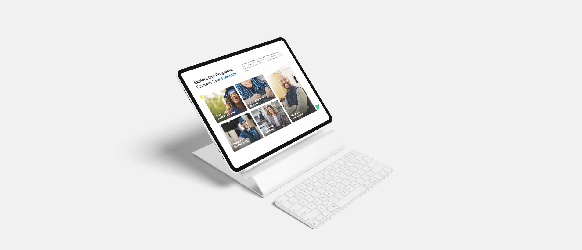
The redesign
brief.
Goodwill Central Texas combines retail, donations, workforce development, and community programs. Visitors needed different things from the same website, while the marketing team depended on development support for routine campaigns.
I worked as an independent designer and developer alongside Goodwill’s stakeholders. My scope connected discovery and information architecture to interface design, a custom WordPress build, and supporting experiences including campaigns, locations, recruitment, and donations.
Mapping the
experience.
The central design problem was how to support several reasons for visiting without making people understand Goodwill’s entire organization first. Program discovery, giving, and finding a location each needed an understandable route.
The artifacts below connect the previous website to journey mapping, program pages, and campaign patterns. They show how the structure carries into the interface and into the tools used to maintain it.
The challenge
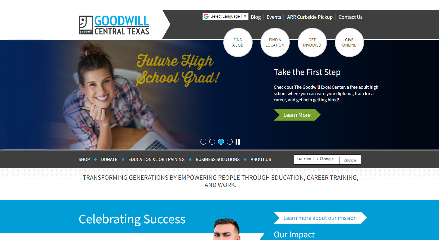
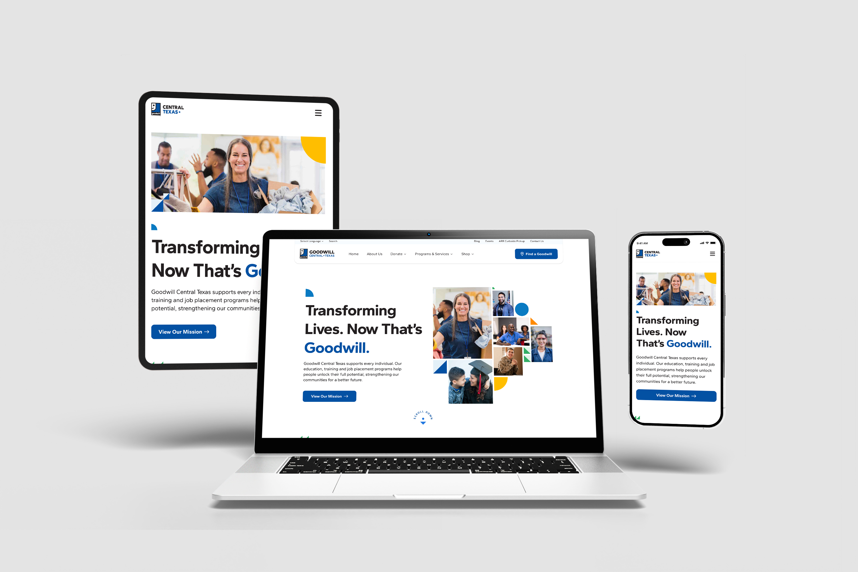
The previous website provided the starting point for the redesign.
Research & structure
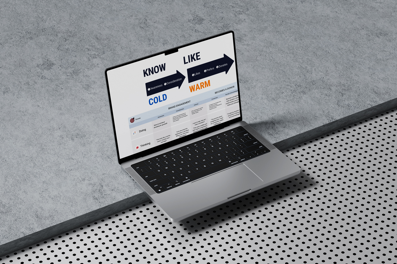
Journey mapping connected different visitor goals to the website’s information architecture.
Design & iteration
Program pages translate the site structure into information and next steps for people seeking support.
A reusable system
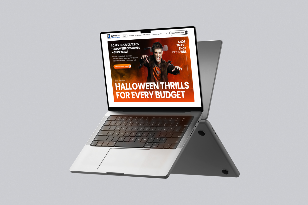
A seasonal campaign shows where the system allows variation while retaining a shared foundation.
Accessibility
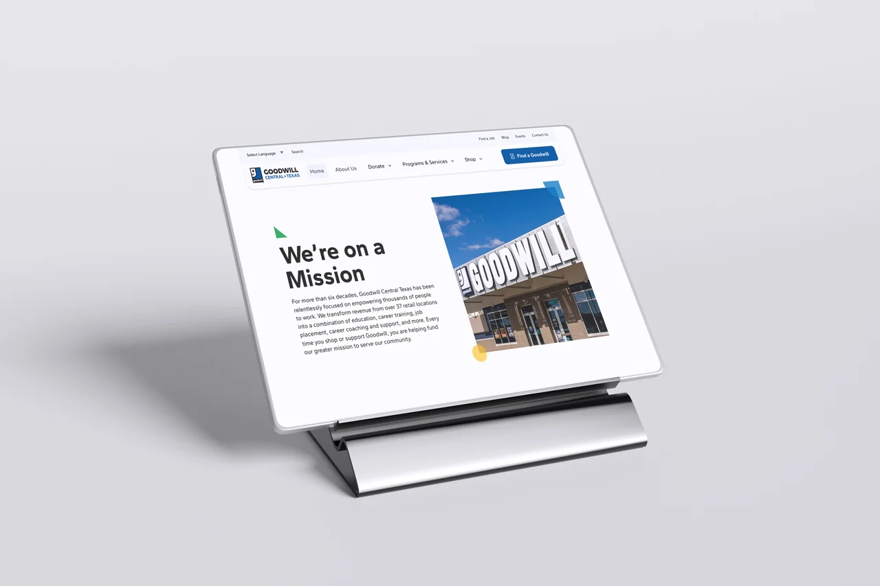
The visual system applied to mission and organization content.
01 / Separate the visitor goals
Make program discovery, donations, and retail understandable as distinct routes within the same organization.
02 / Connect structure to screens
Carry the journey map and sitemap into navigation, page hierarchy, and the actions available on each page.
03 / Design the publishing experience
Support the team behind the website with reusable WordPress patterns for content and campaigns.
Visitors and
publishers.
For this Central Texas nonprofit, the same website needs to support people seeking opportunity, people giving back, and the team serving both.
People seeking opportunity
Find relevant programs, understand the support available, and identify where to go next.
Donors & shoppers
Find a location or a way to give without first navigating the organization’s program structure.
Marketing & internal teams
Publish everyday updates and seasonal campaigns within a consistent system, with less dependence on custom page development.
Accessibility
in the build.
Accessibility decisions connect the content model to the finished interaction. Clear headings and labels help explain the page; semantic structure, keyboard navigation, and screen reader behavior carry that explanation into different ways of using it.
My role across design and development let me work on both sides of that relationship.
More about how I workOne organization. Different reasons to visit.
A job seeker, a donor, a shopper, and someone looking for support arrive with different questions. The experience needed to make those paths understandable while preserving a coherent picture of Goodwill’s mission.
The work involved more than updating the visual design: it meant reconsidering navigation, content relationships, and the tools the internal team used to maintain them.
Start with the journeys.
Stakeholder interviews across leadership, marketing, IT, and mission teams sat alongside a competitive audit and content inventory. The work brought service priorities, existing content, and implementation needs into the same view.
Journey mapping and the sitemap connected those inputs to visitor routes. This was the bridge from organizational context to page templates and navigation, rather than a separate deliverable from the interface.
Make the next step clearer.
Wireframes and high-fidelity designs brought the audience journeys into individual screens. Prototype reviews at milestones helped refine the direction before implementation.
The donation experience went through several design iterations. The broader goal was consistent: make the action understandable, keep the surrounding information useful, and maintain continuity as someone moves between pages.
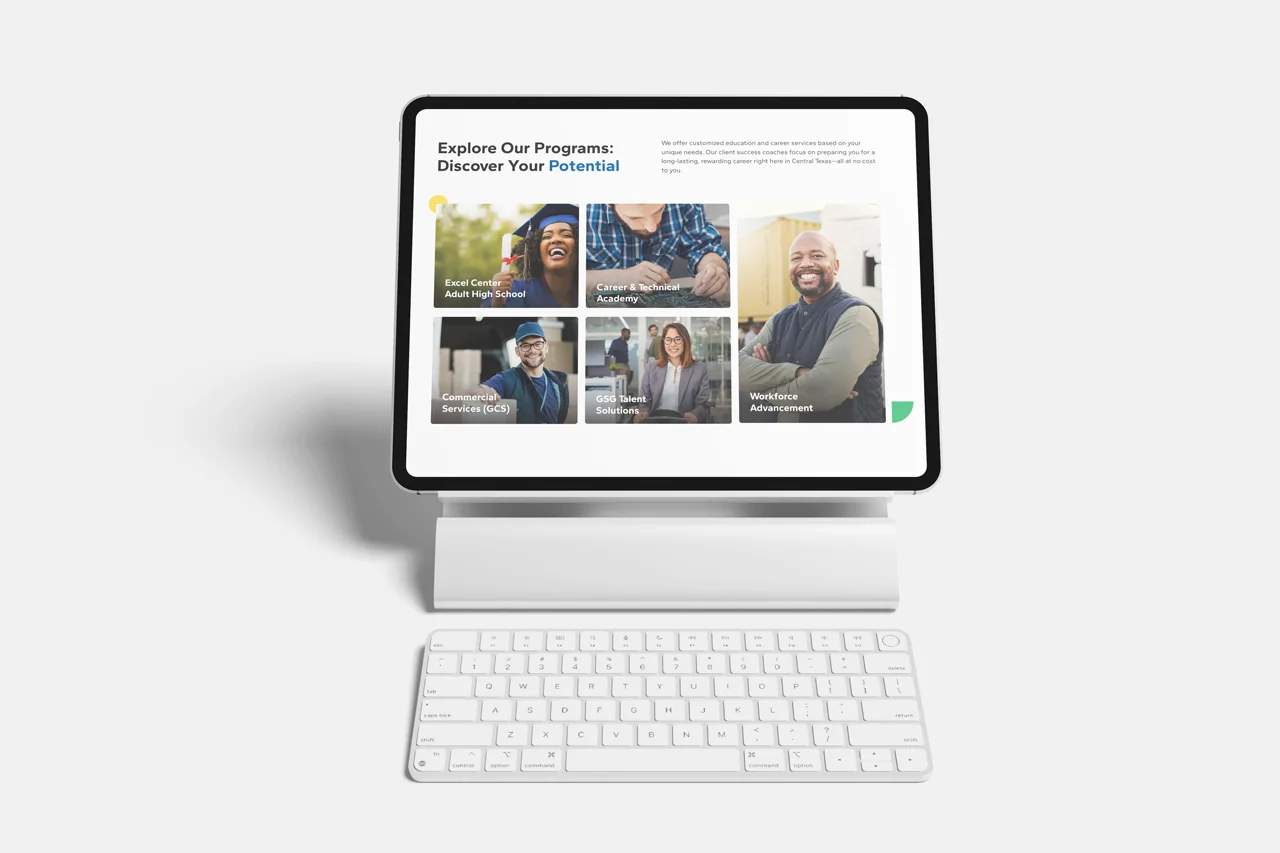
Give campaigns flexibility within a shared system.
Marketing needed room to create seasonal campaigns, while the wider website needed consistency. Reusable WordPress page patterns and campaign templates supported both needs.
The Halloween campaign illustrates that balance: campaign-specific content and presentation within the same publishing foundation. My responsibility extended from the page design to the tools the team would use after launch.
Carry the details through to the build.
The project considered keyboard navigation, semantic structure, labels, screen reader behavior, and accessible documents alongside the visual work. Accessibility decisions belonged in the design and development process, rather than being treated only as a final review.
The resulting patterns connected clear content, navigation, and implementation across the site.
2024 WebAward recognition.
Goodwill Central Texas received the 2024 Non-Profit Standard of Excellence from the Web Marketing Association, submitted by Blue Beacon Creative.
The award credits list Alfredo Mercedes Mejia and Pedro Bare for UX design; Alfredo Mercedes Mejia for WCAG web accessibility; Shakline for web development; and Sheena Ingle for copywriting.
A little more
context.
What was your role?
I worked with Goodwill Central Texas as an independent contractor through Blue Beacon Creative, my solo freelance consultancy. I contributed hands-on product design, UX/UI, and web development alongside its internal stakeholders, from discovery and structure through the WordPress build and ongoing campaign work. The award entry credits my UX design and WCAG accessibility work alongside the project’s design, development, and copywriting collaborators.
How did the project begin?
Stakeholder interviews, a competitive audit, a content inventory, and journey mapping helped connect organizational priorities to visitor needs.
What changed for the internal team?
Reusable page patterns and campaign templates gave marketing a consistent framework for publishing and seasonal experiences.
What outcome can you share?
The work established a flexible foundation for ongoing improvements. Goodwill Central Texas received a 2024 WebAward for Non-Profit Standard of Excellence.
Results and
lessons.
The work delivered a shared foundation for the main website, supporting experiences, and ongoing campaigns. Goodwill Central Texas received a 2024 WebAward for Non-Profit Standard of Excellence.
The most useful lesson was to design for two journeys at once: the visitor completing a task and the internal team maintaining that path. Publishing tools are part of the service experience because they shape what people encounter long after launch.
Next: A11yGenius