A design system.
Built in code.
A design system connecting shared tokens and reusable components to the everyday decisions of building a product.
Design systems / Design & developmentExplore the project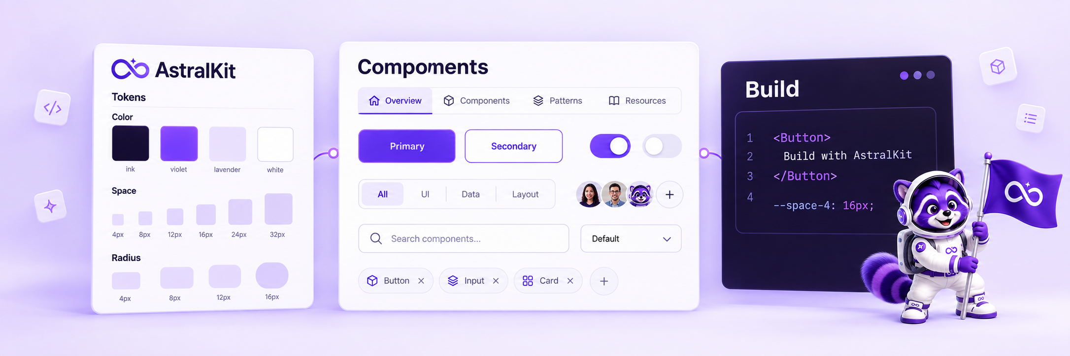
The system
brief.
Repeated interface decisions become harder to maintain when every screen handles them differently. AstralKit gives color, spacing, typography, motion, and components a shared vocabulary that can carry into working code.
I design and develop the system and use it on my Blue Beacon Creative website. That implementation provides a practical setting for refining the relationship between reusable foundations and a distinct product identity.
Tokens and
components.
AstralKit connects reusable components to a shared vocabulary for color, spacing, type, and motion. My freelance consultancy’s website uses that same vocabulary.
My focus is the relationship between the system and the work built with it: enough consistency to make decisions repeatable, with room for the product to have its own identity.
Product website
Product website / Interface overview
System foundations
Design-system editorial concept
01 / Define the vocabulary
Use named tokens to connect choices across the interface.
02 / Build reusable patterns
Carry visual and interaction decisions into components rather than recreating them screen by screen.
03 / Support the build
Bring the system into developer workflows through the library, installation tools, and documentation.
Designers and
developers.
The system is most useful when design intent survives implementation.
Product designers
A consistent foundation for layouts, hierarchy, states, and interaction patterns.
Developers
Reusable components and a token vocabulary that can be applied in working code.
Small product teams
A way to spend more attention on the product-specific problem and less on repeated UI decisions.
Shared patterns.
Flexible identity.
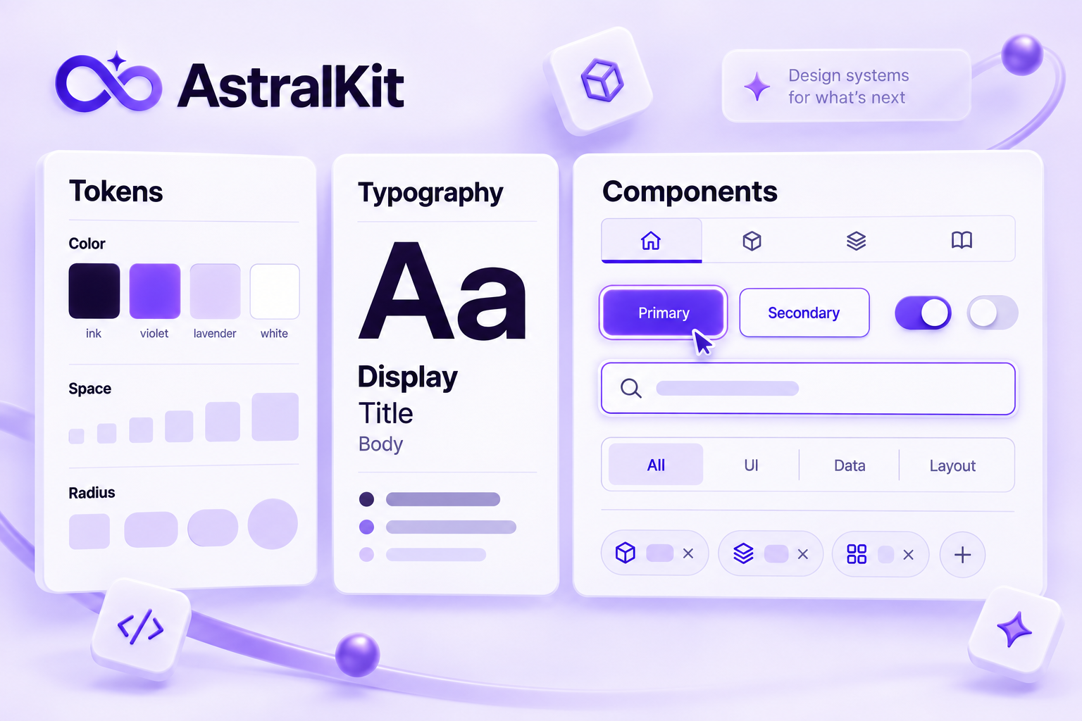
The central question is what should stay consistent and what should vary. Shared tokens and component patterns belong in the foundation; brand expression and task-specific composition need room to respond to the product.
Blue Beacon Creative applies its own palette and typography over AstralKit. It is a concrete example of that separation in use.
More about how I workMake the shared decisions explicit.
Typography, color, spacing, and component behavior need to work together. A token system gives those decisions a shared vocabulary that can carry across screens and products.
My Blue Beacon Creative website applies its own palette and type layer over AstralKit, showing how a consistent foundation can still support a distinct visual identity.
Decide what to reuse and what to leave flexible.
Common controls benefit from a shared visual and interaction vocabulary. A booking interface and a settings view still need different information and task structures.
The library presents both kinds of decisions: reusable components that create continuity, and compositions that respond to a particular task. Treating every screen as identical would lose that distinction.
Keep the system close to the product.
Working across design and implementation helps me see where a pattern is useful and where it needs refinement. A shared source of decisions makes changes easier to carry through an application.
AstralKit brings visual systems, reusable components, and product development into the same practice.
A little more
context.
What does this project demonstrate?
Systems thinking across design and implementation: shared tokens, reusable components, and the workflows that make them practical.
How is it connected to Blue Beacon Creative?
Blue Beacon Creative is my solo freelance consultancy. I use AstralKit tokens and components on its website, giving me a practical setting to test the system and refine the patterns I use in my design and development work.
What is shown in the gallery?
The current product website and an editorial illustration of the system. The illustration is a visual concept rather than a screenshot of a component editor.
Lessons and
next steps.
Using the system in my own work keeps its decisions close to implementation. It gives me a place to examine whether tokens and components support a coherent experience while allowing a separate visual identity.
A useful next evaluation is to observe another designer or developer adopting a pattern: can they find the right component, understand what can change, and implement it without creating a competing convention?
Next: Pinbly